CryptoLens — Next.js Crypto Portfolio Analytics Template
Premium dark-mode Next.js crypto portfolio dashboard template with real-time PnL analytics, multi-wallet tracking, and Tailwind v4 + shadcn/ui.
Secure checkout via Gumroad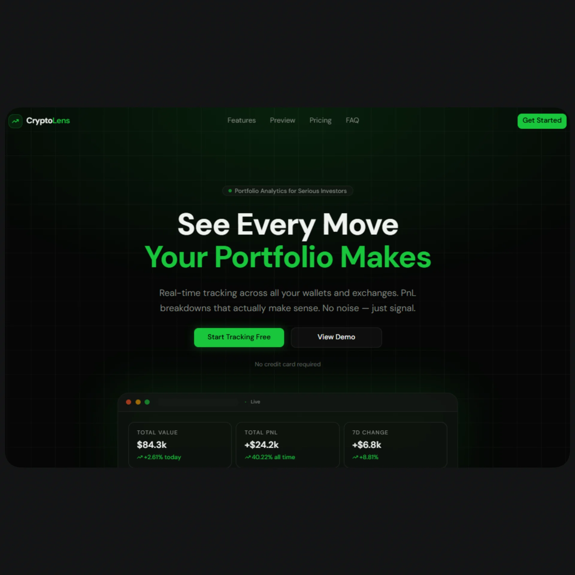
Overview
CryptoLens is a premium, dark-mode-only Next.js template built for crypto portfolio trackers, fintech dashboards, and Web3 analytics products. It combines a high-converting marketing landing page with a fully designed internal application covering portfolio overview, PnL analytics, asset watchlists, and multi-wallet management — everything a crypto SaaS founder needs to launch fast without starting from a blank canvas. Built on Next.js App Router, Tailwind CSS v4, and shadcn/ui, the template follows modern conventions for performance, accessibility, and maintainability, making it equally suitable for an MVP or a production-grade fintech product.
The design language centers on a neon-green primary accent set against a near-black oklch background, evoking the profit-driven aesthetic of trading terminals and on-chain analytics tools, while violet and amber accents handle secondary highlights and loss states respectively. Every chart, table, and card is powered by real (demo) data structures that mirror what a production crypto API would return — portfolio value, realized and unrealized PnL, asset allocation, wallet balances, and transaction history — so wiring up your own backend or third-party data provider (CoinGecko, Zerion, Covalent, exchange APIs) is mostly a matter of swapping data sources, not rebuilding UI. Animations powered by Motion add polish to page transitions, counters, and interactive elements without sacrificing performance.
CryptoLens ships with reusable design tokens for gradients and glow effects, a centralized configuration file for all content and SEO metadata, and a component library built almost entirely from shadcn/ui primitives (Accordion, Tabs, Dialog, Table, Select, Switch, Avatar, and more), ensuring consistency and easy long-term maintenance. Whether you're building a crypto portfolio tracker, a DeFi analytics dashboard, an exchange companion app, or a fintech SaaS with a similar data-dense UI, this template gives you a production-ready foundation with best-in-class developer experience.
Stack
- Framework: Next.js (App Router)
- Language: TypeScript
- Styling: Tailwind CSS v4 (oklch color system, dark mode only)
- UI Components: shadcn/ui
- Animation: Motion (
motion/react) - Icons: lucide-react
- Charts: Recharts (Area, Bar, Pie/Donut)
Project Structure
.
├── app/
│   ├── layout.tsx                 # Global layout — imports baseMetadata & globals.css
│   ├── page.tsx                   # Landing page (composes all marketing sections)
│   ├── globals.css                # Theme tokens, oklch palette, gradients, glows
│   │
│   ├── dashboard/
│   │   └── page.tsx               # Portfolio overview: stats, PnL chart, assets table
│   ├── portfolio/
│   │   └── page.tsx               # Full holdings table, allocation donut, search/sort
│   ├── pnl/
│   │   └── page.tsx               # PnL analytics by period, realized vs unrealized
│   ├── watchlist/
│   │   └── page.tsx               # Market watchlist, price alerts, sparklines
│   ├── wallets/
│   │   └── page.tsx               # Per-wallet balances, tx history, distribution
│   └── settings/
│       └── page.tsx               # Account, notifications, exchange API keys, security
│
├── components/
│   ├── landing/
│   │   ├── Navbar.tsx
│   │   ├── Hero.tsx
│   │   ├── Stats.tsx
│   │   ├── Features.tsx
│   │   ├── Pricing.tsx
│   │   ├── Testimonials.tsx
│   │   ├── FAQ.tsx
│   │   ├── CTAFinal.tsx
│   │   └── Footer.tsx
│   ├── dashboard/
│   │   └── Sidebar.tsx             # DashboardShell — sidebar + mobile nav for app pages
│   └── ui/                         # shadcn/ui components (button, card, table, etc.)
│
├── lib/
│   ├── config.tsx                  # All site content, nav, demo data, SEO copy
│   └── metadata.tsx                # baseMetadata + generateMetadata() + per-page exports
│
└── public/
    └── (icons, og image, favicons)
Quick Start
-
Install dependencies
npm install -
Run the development server
npm run devOpen http://localhost:3000 to view the landing page. Internal app pages are available at
/dashboard,/portfolio,/pnl,/watchlist,/wallets, and/settings. -
Wrap internal pages with the dashboard shell
Each page under
/dashboard,/portfolio, etc. should be rendered insideDashboardShell(fromcomponents/dashboard/Sidebar.tsx) to get the sidebar navigation and mobile topbar:import { DashboardShell } from "@/components/dashboard/Sidebar"; export default function Layout({ children }: { children: React.ReactNode }) { return <DashboardShell>{children}</DashboardShell>; }This is best placed in a nested
app/(app)/layout.tsxroute group wrapping all internal pages. -
Build for production
npm run build
npm start
Customization
1. Content & copy
Every piece of text in the template — hero headline, features, pricing plans, FAQ, footer links, navigation — lives in lib/config.tsx. Update the exported objects (heroContent, featuresContent, pricingContent, etc.) to rewrite the landing page without touching component code.
2. Demo data
Portfolio stats, asset holdings, PnL history, watchlist items, and wallet balances are also defined in lib/config.tsx (demoPortfolioStats, demoAssets, demoPnLChart, demoWatchlist, demoWallets). Replace these with data fetched from your API, a crypto data provider, or exchange integrations — the component props and data shapes are designed to map directly onto typical crypto API responses.
3. Color palette & theme
All colors are defined as oklch CSS variables in app/globals.css. To change the accent color (currently neon green), update --primary, --ring, --chart-1, and --sidebar-primary. Reusable gradients and glow effects are also defined as CSS variables (--background-image-gradient-hero, --shadow-glow-primary, etc.) — update these once and the effect propagates across every section that references them.
4. Navigation
- Landing page nav links:
navLinksinlib/config.tsx - Internal app sidebar links:
appNavinlib/config.tsx(each entry includes alucide-reacticon)
5. Components
All UI primitives come from shadcn/ui (components/ui/). To adjust global component styling (radius, spacing, variants), edit the relevant component file directly or update the --radius token in globals.css, which cascades to --radius-sm through --radius-4xl.
SEO Setup
-
Update
siteConfiginlib/config.tsx:name,tagline,description,url,ogImage,keywords,twitter,authors
-
Per-page metadata lives in
pagesMetadata(also inlib/config.tsx). Each entry defines atitleanddescriptionfor one route. -
Apply metadata in each page using the helper exports from
lib/metadata.tsx:export { dashboardMetadata as metadata } from "@/lib/metadata";Or generate custom metadata for a new route:
import { generateMetadata } from "@/lib/metadata"; export const metadata = generateMetadata({ page: "dashboard", path: "/dashboard", }); -
Global metadata (Open Graph, Twitter cards, robots, icons, manifest) is exported as
baseMetadatafromlib/metadata.tsx— import and spread it in your rootapp/layout.tsx. -
Replace placeholder assets: add your own
favicon.ico,icon.svg,apple-touch-icon.png, and Open Graph image (og.png, 1200×630) to thepublic/directory, matching the paths referenced inbaseMetadata. -
Canonical URLs: update
siteConfig.urlto your production domain — all canonical URLs and Open Graph URLs derive from this value.
Final Notes
- This template is dark-mode only by design — there is no light theme toggle, keeping the visual identity consistent with fintech and trading platforms.
- No inline
style={}is used for theming; all colors, gradients, and glows are driven by CSS variables inglobals.css, making global restyles fast and consistent. - All demo data is illustrative. Before going to production, connect a real data source (CoinGecko, exchange APIs, on-chain indexers, or your own backend) and replace the
demo*exports inlib/config.tsx. - Components are built to be responsive from mobile to desktop out of the box — test breakpoints (
sm,md,lg,xl) when customizing table columns or grid layouts, as several elements progressively hide/show columns at each breakpoint. - For support, customization requests, or licensing questions, refer to the FormaUI template page linked above.